Live
Study abroad App Redesign
Launched in 2021, the IDP Live App helps students explore study programs, talk to counsellors, and track applications. Within a year, engagement signals and user feedback were surfacing usability issues that the legacy patterns couldn't absorb, so we ran an iterative redesign to clarify the core journeys.
Client
IDP Education supports international students studying and relocating abroad, with 190+ offices across 35 countries.
Timeline
2023 to 2024, delivered in iterative phases
Design Team
Experience Design Lead: Logic & Strategic Oversight
UX/UI Designer (me): Redesigned the home, explore, and course detail screens and the app's UI kit
My Contribution
UX/UI design, lo-fi and hi-fi prototyping, user testing, UI kit, stakeholder collaboration, design QA
+
Shortlist Adds
(Q4 2023 vs. Q4 2022)
+
Course detail page views
(Q4 2023 vs. Q4 2022)
-
Home BR
(Q4 2023 vs. Q4 2022)
Context
Before the redesign
Screenshots of the legacy app (2021-2022). The legacy experience showed inconsistency across screens, with oversized components, cluttered cards, and buried entry points to features like search.
Define
Key challenges
This was an iterative redesign focused on clarity and consistency across the app, scoped to address visual inconsistency and simplify navigation rather than overhaul the product. Priorities were defined through stakeholder workshops and app analytics, with the four key challenges below shaping the design work that followed.
#4
The home screen lacked clear guidance
Home screen bounce rate sat well above category norms, and the screen surfaced content without clear pathways into core features. Aligned as the top priority in stakeholder workshops.
#3
Core features were under-utilised
App analytics flagged engagement with browse, shortlist, and search well below targets, with most sessions concentrated on a narrow set of screens.
#2
The interface was perceived as outdated
Stakeholder workshops flagged the interface as visually dated, particularly against newer education-sector apps, affecting first-impression credibility.
#1
Inconsistent navigation across screens
Navigation patterns differed between screens, and analytics showed users repeatedly returning to home before reaching destination screens. Surfaced in stakeholder workshops as a priority to fix.
Strategy
Design principles
↘
Strengthen visual consistency to rebuild trust, aligned with the parent IDP brand.
↘
Smooth the most-used paths through the app, prioritising tap-count reduction over structural change.
↘
Promote core features into more visible positions to lift adoption.
↘
Restructure the home as a guided entry point with clear next actions.
New
Home & Side Menu
Hover to view 'Before'
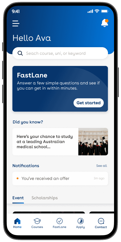
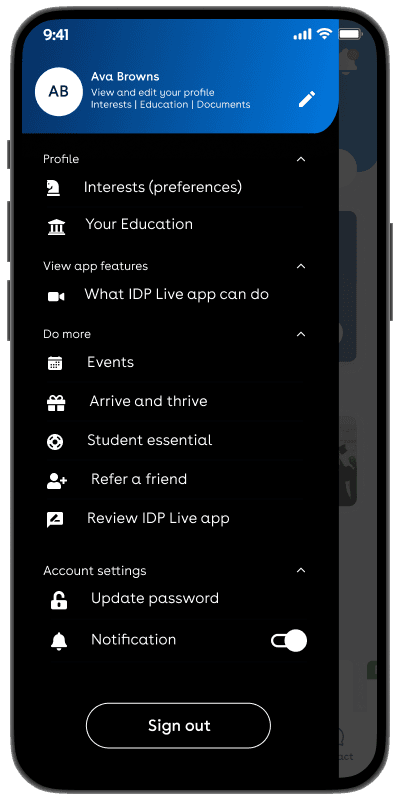
The home screen was restructured around the user's intent at the moment of opening the app: where to go next. Rather than a generic content showcase, the new layout leads with search and personalised prompts, with secondary utilities tucked into a side menu so the main canvas stays focused on action.
Prominent search
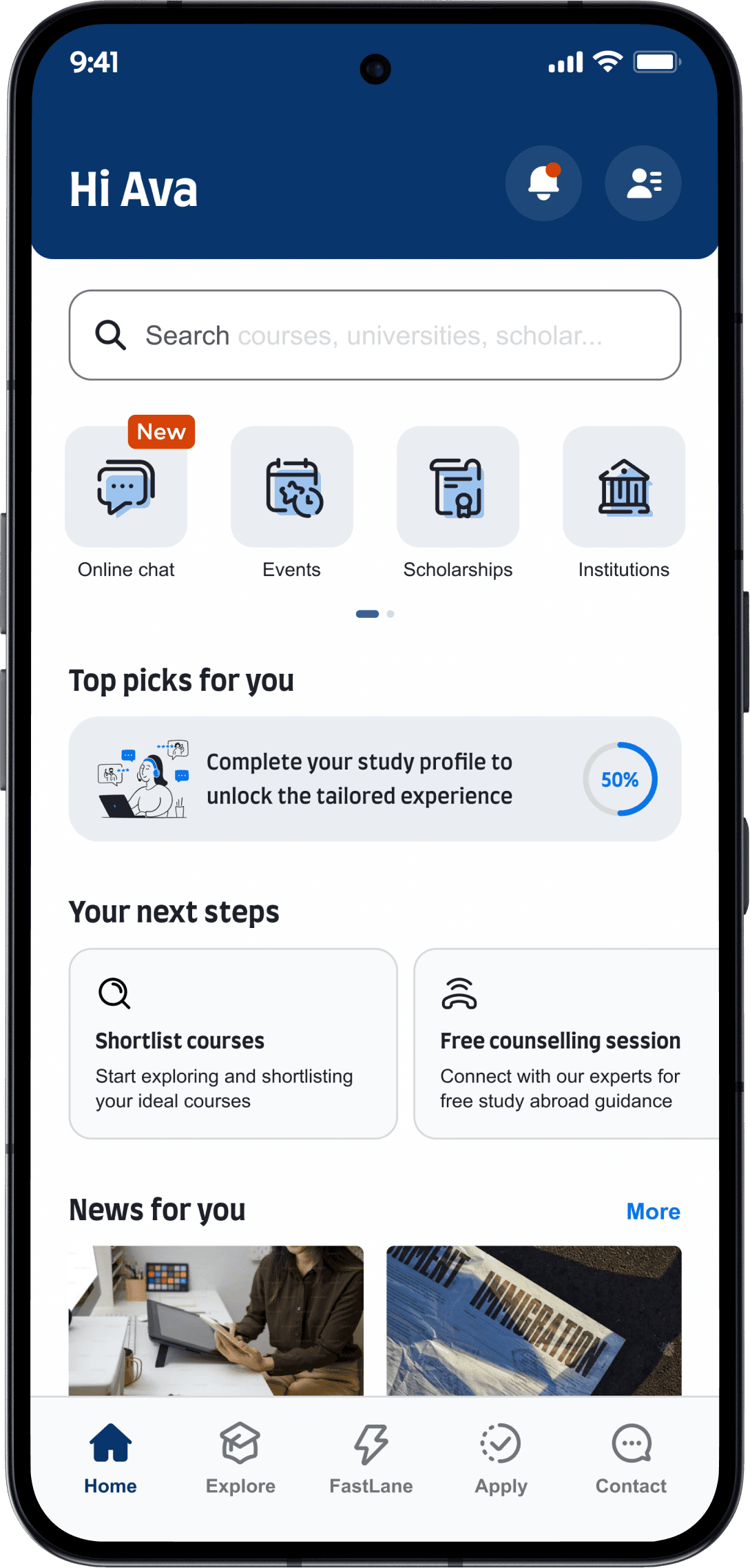
Incomplete profile
Quick access to
tools/services
Profile completion
gate
Personal hub,
core utilities
Side nav
Settings
Joruney guidance
New
Explore study options
Hover to view 'Before'
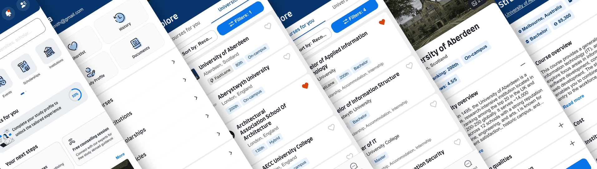
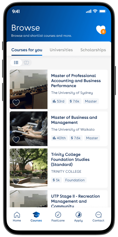
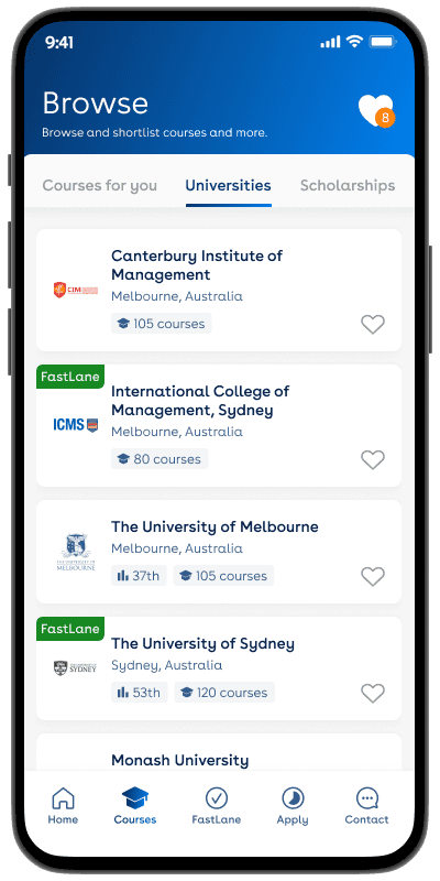
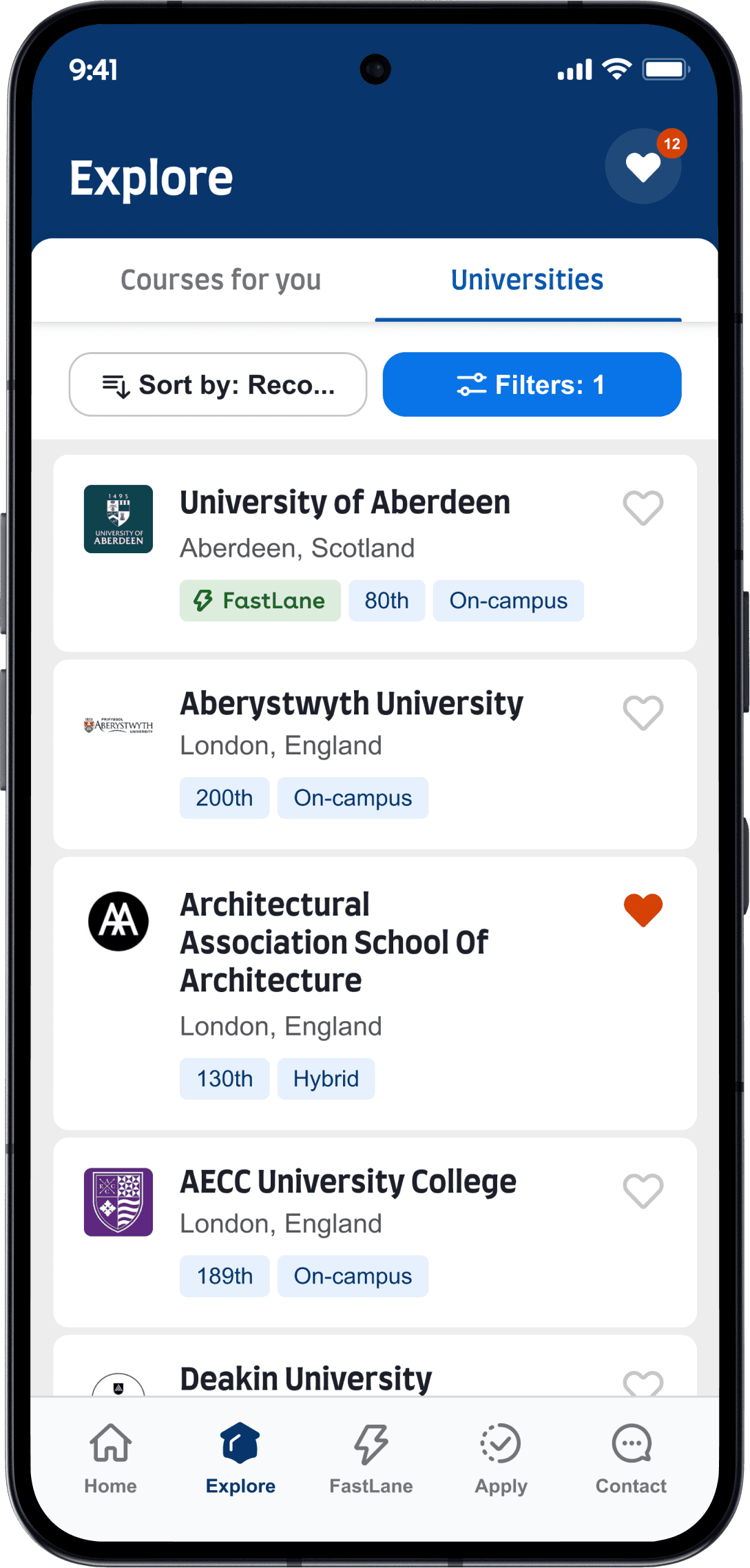
The Explore screen was redesigned to support the actual behaviour users had on this surface: comparing options and saving the ones worth returning to. Card layouts were restructured to lead with the details users compare on, with sort and filter functions refined to support faster narrowing. Card iterations were tested with users to refine specifics.
New sort &
filter functions
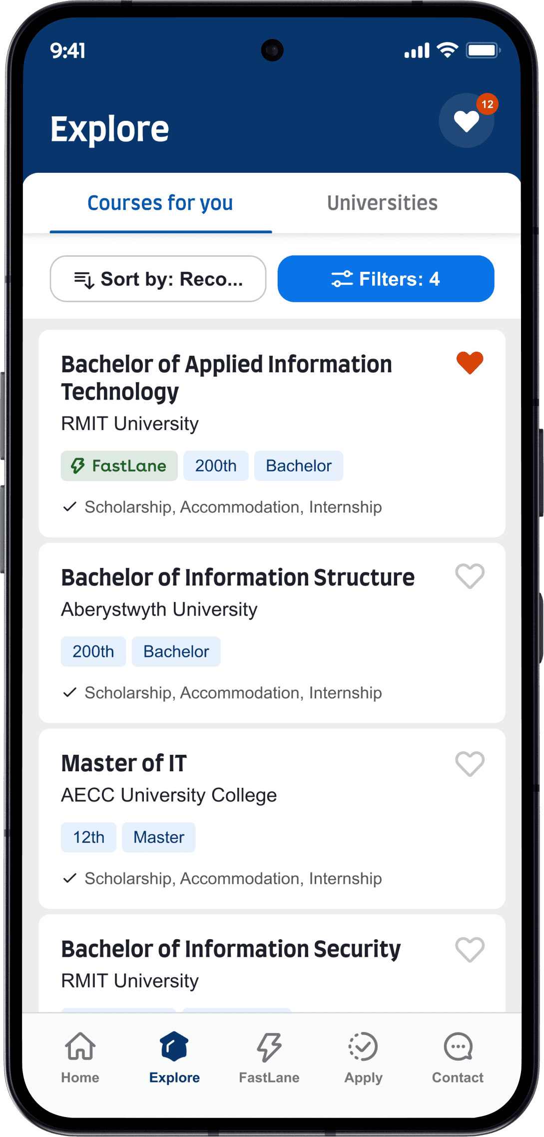
Course listing
New course
card design
New university
card design
Open shortlists
Card iterations, tested with users
Before finalising the card design, multiple design iterations were tested with 8 student users.
7 of 8 participants wanted scholarship, fees, and accommodation surfaced upfront, and 5 preferred the FastLane tag sit alongside other labels. The testing also surfaced tension on the button placement, users found the buttons visually disruptive.
In response, the final design dropped the buttons entirely in favour of a full-card tap interaction. Each finding mapped to a specific refinement before launch.


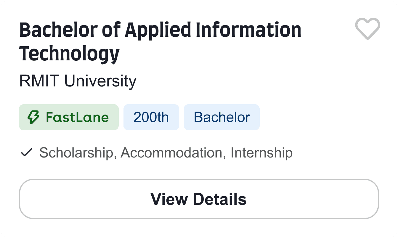
New
Course & Uni details
Hover to view 'Before'
Course and university detail screens were restructured to support the decision-making behaviour users showed in research: qualifying a course quickly before deciding whether to go deeper. Key attributes lead, secondary content sits behind collapsible sections, and the primary action remains visible throughout the screen.
Replaced oversized
course hero images
Key attributes
surfaced upfront


The floating primary
CTA reinforces a
clear next step
Simplified IA and
structured browsing
using collapsible
sections
Supporting actions
remain secondary
Added a gallery for
sponsored universities
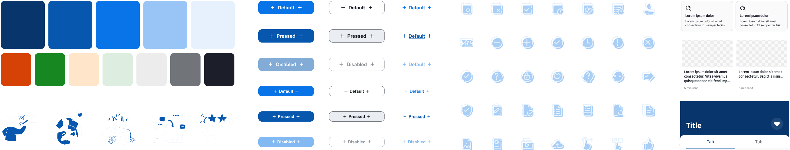
UI
Refreshed Look & feel
I built on existing patterns and integrated the updated IDP branding to establish an app-specific sub-system that strengthens visual and component consistency. It maintains alignment with the parent brand while enabling more distinctive UI components, anchored in the legacy blue theme.
Impact
Impact on users and the business
The redesign clarified the core journeys, simplified content hierarchy, and reduced friction across the screens where users were dropping off. The result was measurable improvement in how users explored, compared, and saved.
↘
+27% shortlist additions. A clearer card, refined filters, and a more accessible shortlist icon shortened the path from browsing to saving. Card iterations were validated through user testing.
↘
+19% course detail page views. A scannable fact summary and stronger CTAs made the detail screen easier to scan and act on.
↘
−7.5 pp home bounce rate. An action-oriented home, prominent search, and visible next steps reduced drop-off at the entry point.
↘
1M+ users by 2024. The redesigned app now serves a meaningfully scaled user base, with patterns and components established to support continued growth.
↘
A consistent UI foundation. An app-specific sub-system aligned with the parent brand, built on the redesigned components to support faster feature work.