Live
IDP WEBSITE Overhaul
IDP's website served students and parents in 35 countries, but each region had drifted into its own visual language, navigation, and patterns. The revamp brought 50+ core pages onto a single, consistent foundation, designed to scale as the product grew.
Client
IDP Education supports international students studying and relocating abroad, with 190+ offices across 35 countries.
Timeline
2023 - 2024 (launched 2024)
Design Team
Experience Design Lead: Design System & Strategic Oversight
UX/UI Designer (me): Owned the end-to-end design execution across MVP pages
My Contribution
Problem framing, IA and user flows, lo-fi and hi-fi prototyping, user testing, design system contribution, cross functional collaboration, post launch evaluation
+
Core pages
redesigned
+
Components
consolidated
+
Enquiry conversion
Q1 2024 vs. Q1 2023
+
Account sign-ups
Q1 2024 vs. Q1 2023

Context
The Legacy experience
Drag to view snapshots of the legacy IDP.com (2023). Years of organic growth had left the visual language outdated, with oversized components and inconsistent application across pages.


Discover
The starting point
I joined stakeholder workshops led by the senior team to understand the business goals, content priorities, and where users were dropping off, learning that the legacy site was a barrier to several of those goals. Alongside that, the CX research team had produced personas and user journey maps that traced where students and parents lost confidence. My role was to take both threads, business priorities and user friction, and translate them into the design decisions that shaped the revamp.
Define
Key problems to solve
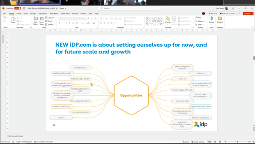
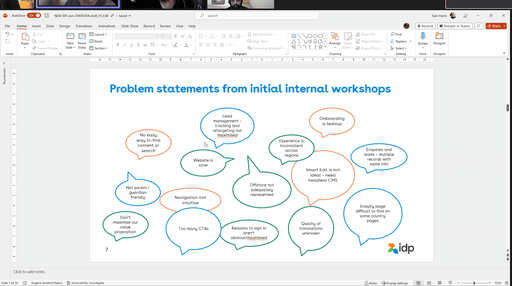
Through these activities, we identified four key problems that shaped the redesign direction and informed the design interventions that followed.
#4
The product had no foundation to scale on
Regional sites had drifted into their own UI patterns, layered over an aging design system, eroding brand cohesion and slowing every team building on the legacy.
#3
Low account adoption: users had no reason to sign in
The platform did not communicate why creating an account was worth the effort, so most users never did.
#2
Users were asked to convert too early, too often
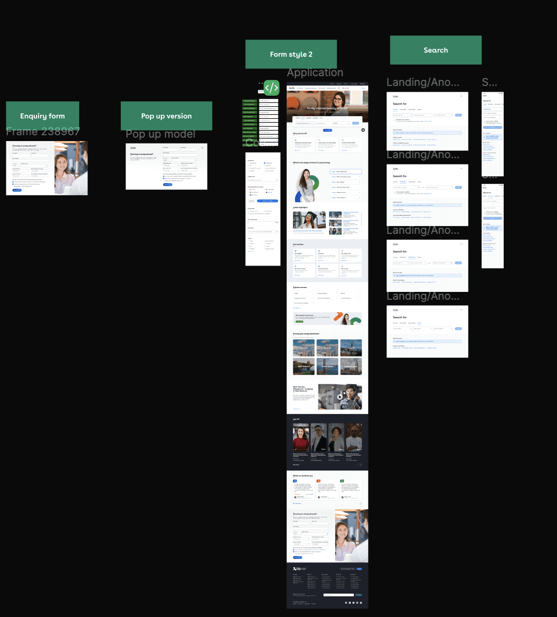
Overwhelming enquiry forms placed prominently across pages introduced friction too early; multiple CTAs further diluted key actions.
#1
Users left early because navigation was confusing
Information hierarchy and navigation were unintuitive, making it difficult for users to find relevant content or identify next steps. Many dropped off before reaching anything useful.
Information Architecture
From structure to wireframes
1) IA and user flow
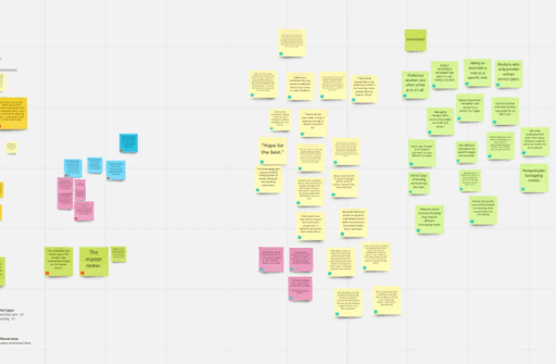
The legacy navigation had been built around content structure and business logic. I joined the Content team's card sorting sessions and contributed to iterative IA refinement, restructuring the navigation around how users actually browse.
Alongside the IA work, I mapped how an anonymous user moves from discovery to enquiry. The flow tested the new structure end to end, exposing gaps and shaping how filtering, shortlisting, and enquiry would connect.
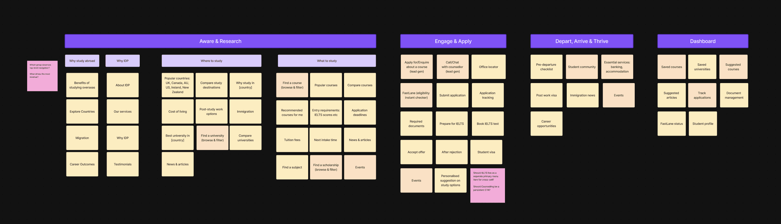
New IA
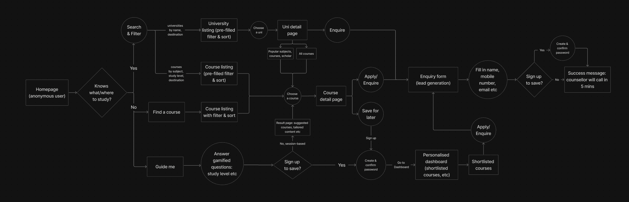
User flow
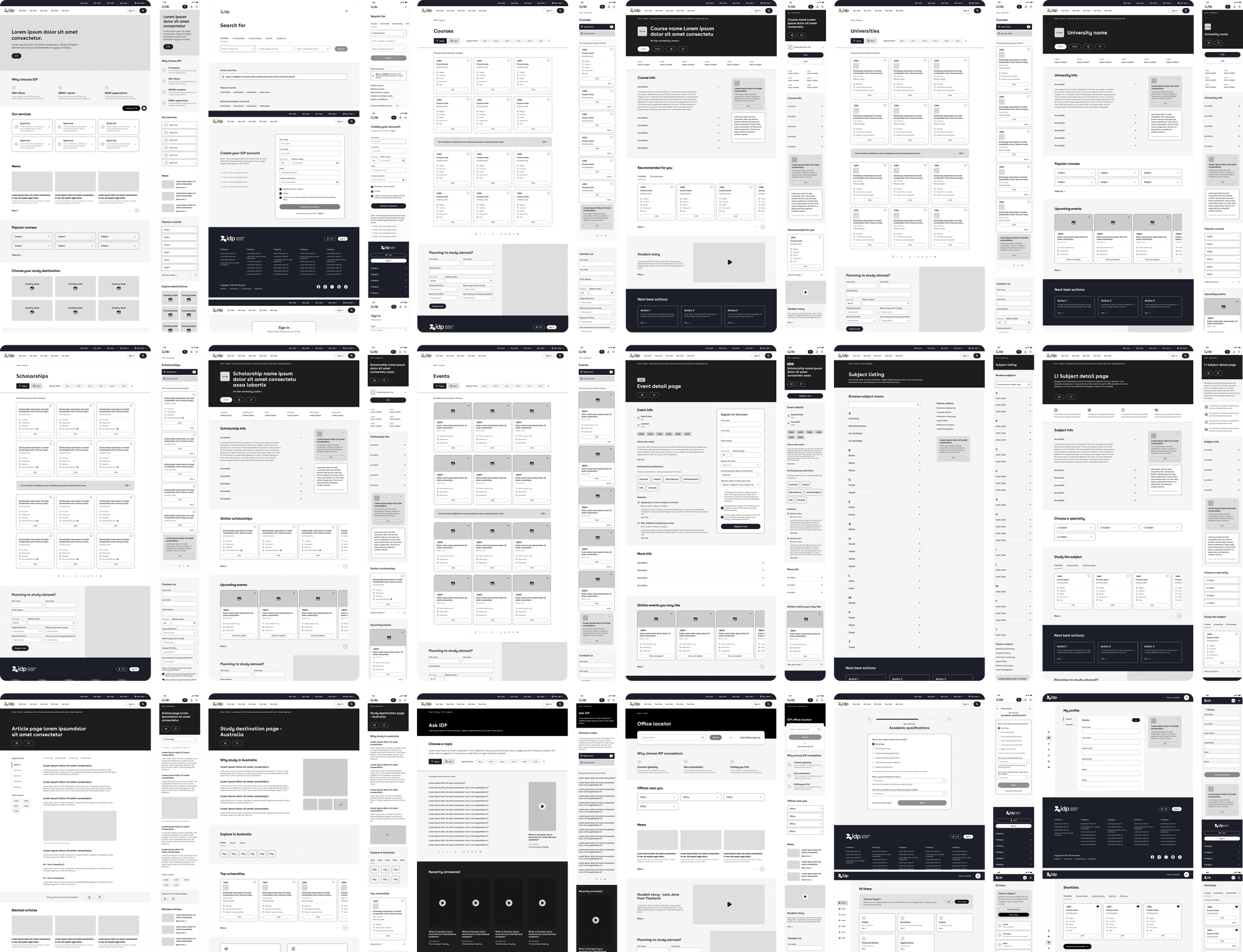
2) Page composition and team alignment
I translated each MVP page into a structured content hierarchy and modular layout, with components designed for reuse across page types. These wireframes evolved through iterative reviews with Content, SEO, Product, Business Analysis, and Tech Lead, with technical workshops aligning on feasibility before build.
Delivery
Implementation & Rollout
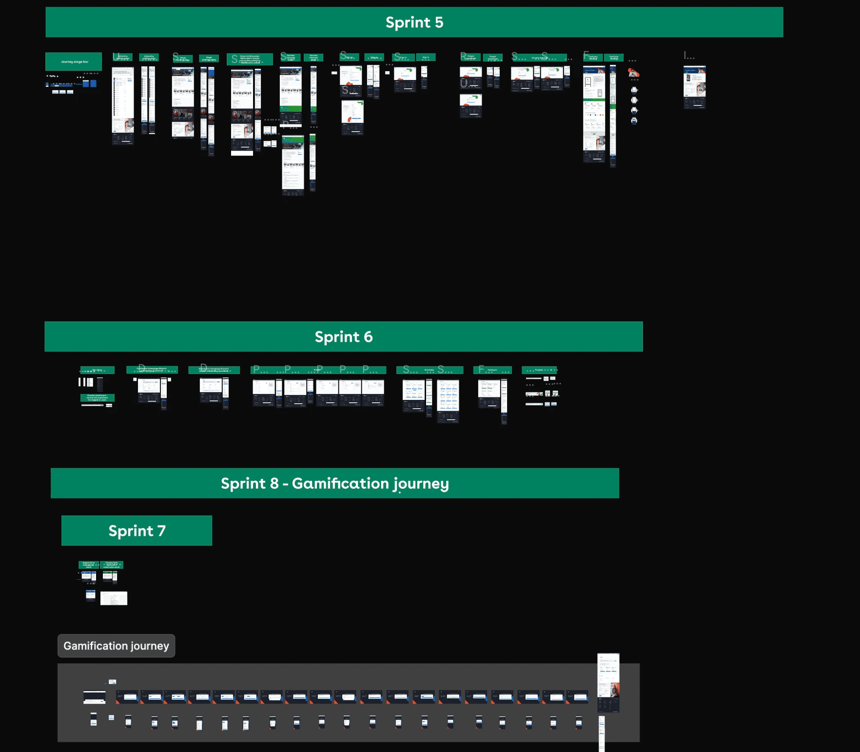
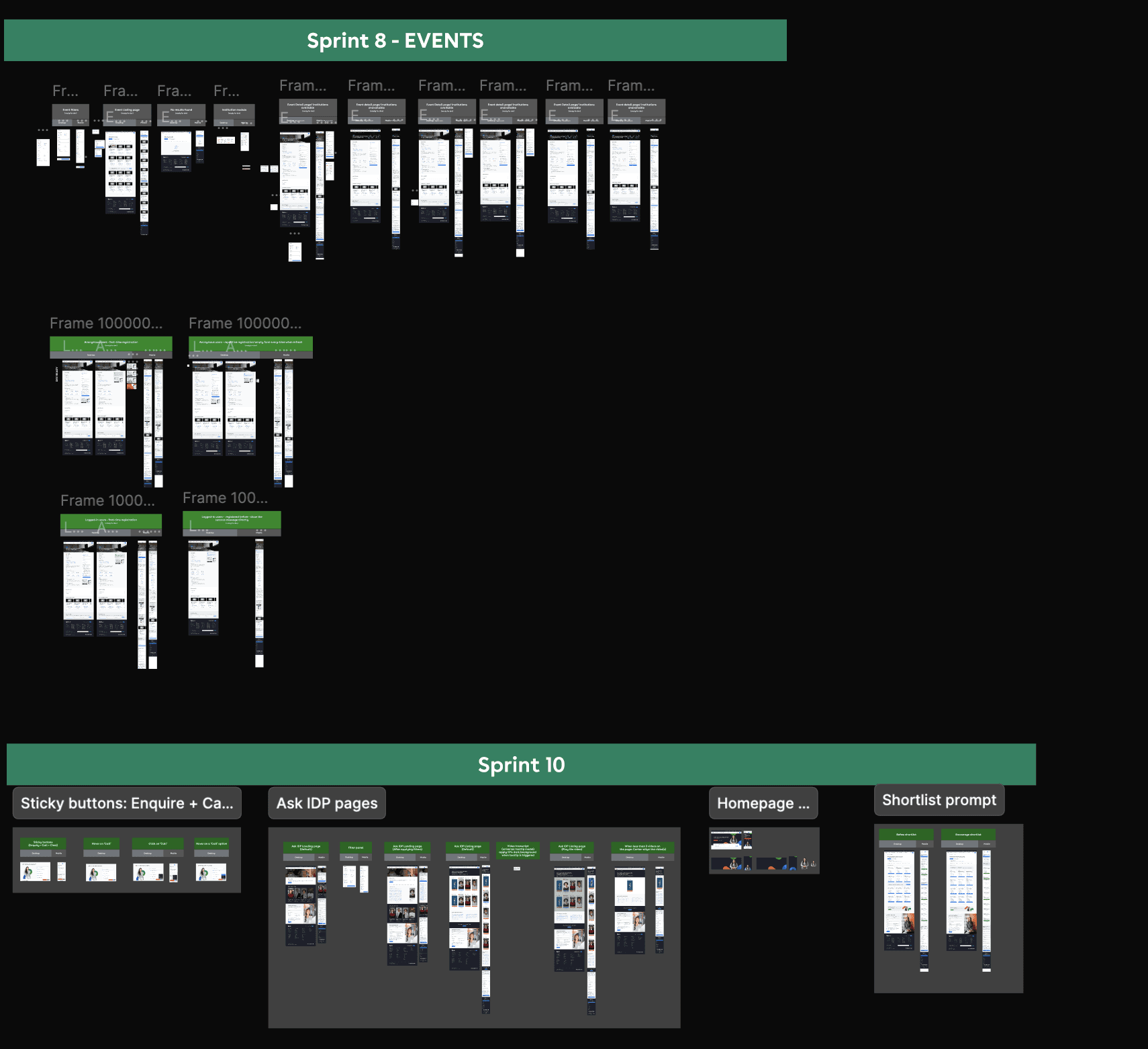
Across 12 sprints with the development team, my role shifted from designer to design partner. I produced Figma documentation and walked the team through prototypes, then stayed close to the build through review cycles, providing feedback on specs and picking up the smaller cases that hadn't been scoped into the original design (e.g. edge state screens) so the team didn't have to design them on the fly.
The new idp.com rolled out in 2024. Regional teams flagged the unified system as a meaningful improvement over the legacy experience, and the design system has since been used as the basis for ongoing expansion across markets.

Highlights
Key Design Solutions
The redesign tackled the four problems identified above through a mix of page-level redesigns and cross-site systems. The highest-impact moves are shown below, each maps back to one or more of the problems, with the trade-offs and rationale that shaped the design.
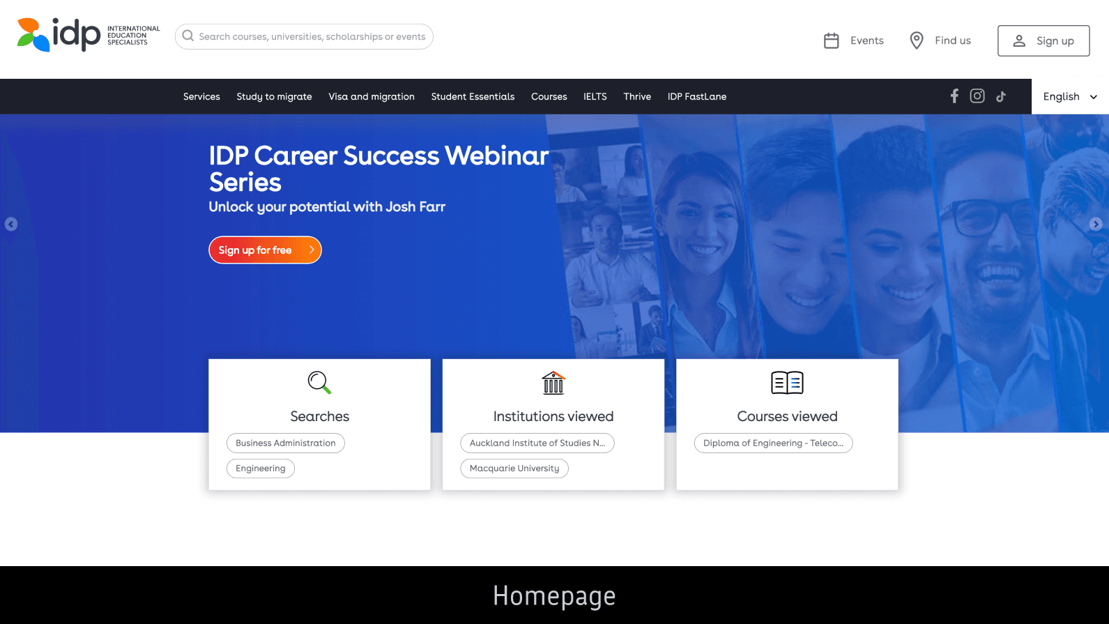
Homepage
Hover to view 'Before'
Search-led hero
Search moved from header utility to the hero's primary action, making discovery the main path in.
Trust built into the journey
Why IDP stats, testimonials, and FAQs build credibility before the conversion ask.
Convert without crowding
Enquiry form repositioned to the bottom, available on demand via a persistent "Contact us" pill


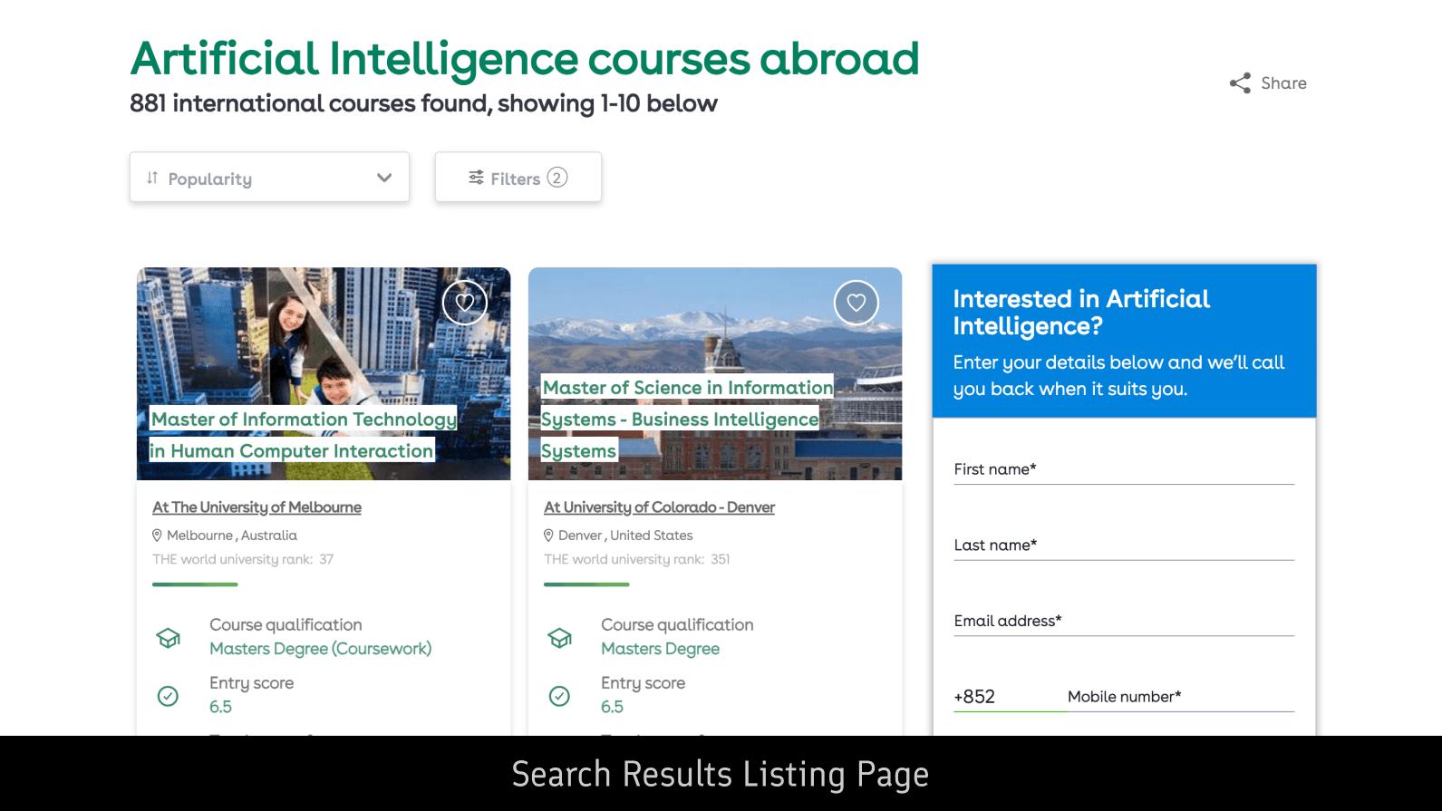
Listing Page: Courses
Hover to view 'Before'
Unified listing template
One shared pattern across all five listings, so the experience stays familiar regardless of what users are browsing.
Filter shortcuts surfaced
One-tap chips above the filter panel surface the most-used refinements, common journeys never require opening filters.
Decision-led card
Restructured around the facts users actually compare on, with decorative imagery tucked away.


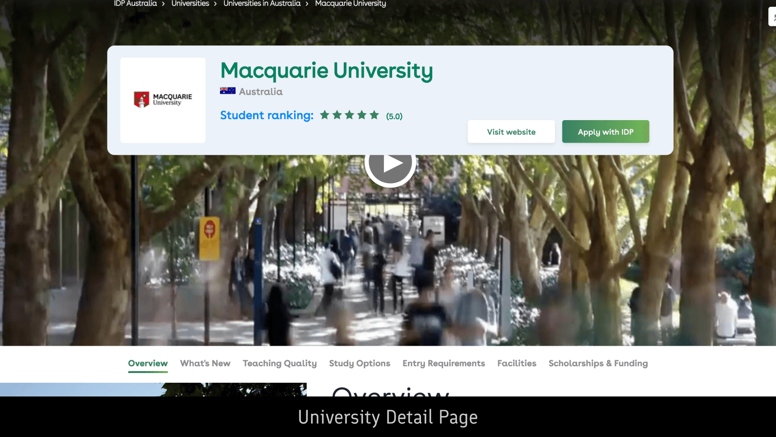
Detail Page: University
Hover to view 'Before'
Restructured fact summary
Pared to five qualifying facts in a dedicated card, scannable in seconds
Rebalanced CTAs
Competing buttons consolidated, with the primary action given clear hierarchy.
Next best action
Suggests the next step based on the user's journey stage to move forward.


Journey Stages
New
Collapsible stage bar
Expanded to show the linear journey, collapsed to reclaim screen space.Visible only on content pages where guidance is most relevant.
Per-stage landing pages
Six stages, each with step-by-step guidance, supporting tools, and contextual content for that phase of the journey.
Homepage entry point
The "Study abroad steps" section on the homepage gives first-time visitors a way into the journey flow and signposts where they're at.


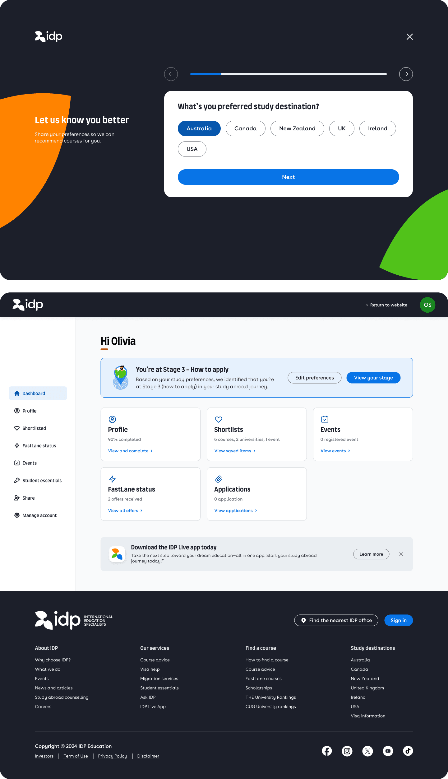
Onboarding Quiz + User Dashboard
New
Five-question preference quiz
Identifies the user's journey stage from quiz answers, then personalises content recommendations site-wide.
Personalisation before sign-up
The quiz routes users to a course listing tailored to their answers, showing personalised results without requiring an account.
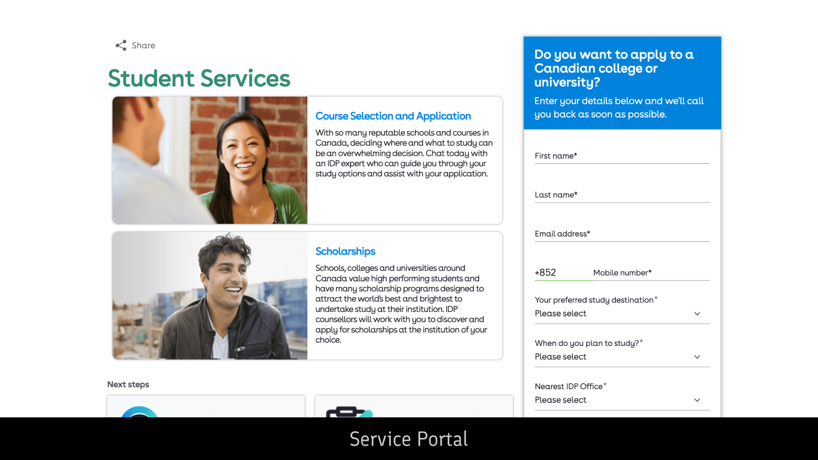
Centralised dashboard
Consolidates profile, shortlists, event registrations, and linked services into one space, giving signed-in users a clear reason to come back.

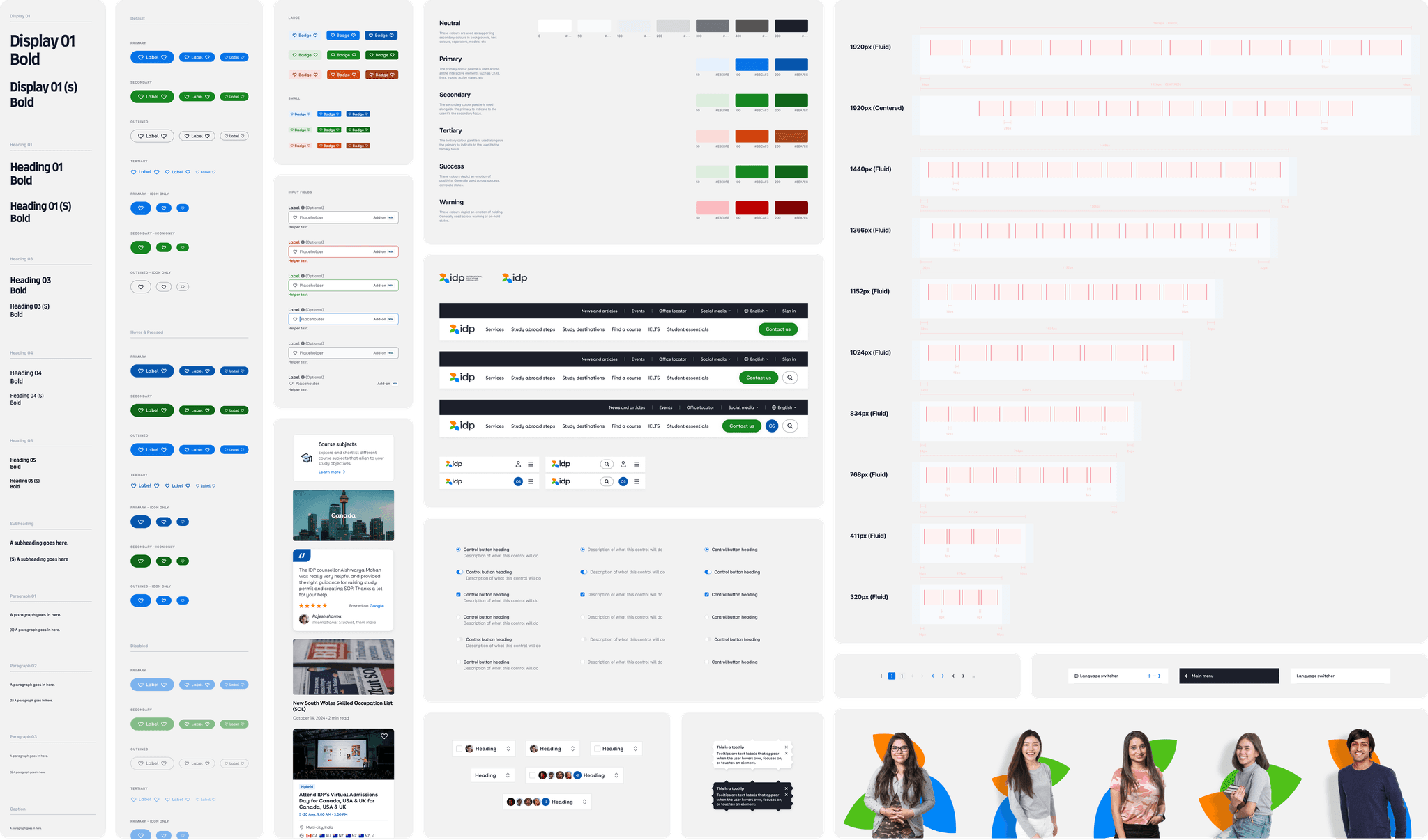
System
Branding + Design System
I designed the look and feel of the new homepage, using it as the reference for the new visual language. The legacy site's heavy gradients gave way to a flatter, modern aesthetic. hose component styles then fed into the broader system update, where I helped expand and organise the legacy components into a 300+ modular library.
Impact
Impact on users and the business
Delivered end to end design for the new IDP website, simplifying a fragmented experience into a clearer, more guided journey for students and parents navigating one of the biggest decisions of their lives.
↘
+17% enquiry conversion. Reduced upfront friction and clearer CTAs lifted conversion across key pages.
↘
+23% account sign-ups. The new dashboard and integrated sign-in touchpoints gave users a reason to invest in the relationship.
↘
300+ components consolidated into one design system, removing ad-hoc builds and supporting consistent regional rollouts.
↘
Improved transparency of the study abroad journey by introducing dedicated stage pages and contextual guidance at key decision points.
↘
Created a stronger foundation for ongoing product growth, enabling regional teams to ship new pages and features faster post launch.
Reflections
Looking back
Working through disagreement. The hardest call was the enquiry form. Marketing Directors wanted it kept upfront, worried that moving it would cost conversion. I argued the opposite, since prominent forms were creating the friction we were trying to remove. We landed on a relocation paired with a persistent "Contact us" pill, and conversion held up. That outcome only happened because both sides had to make their case before we shipped.
A call I defended. The Service Lead initially wanted the dashboard to inherit the global navigation at the top for easier access to all the site features. I argued for only having a dedicated side nav, with a single link back to the main site, on the basis that a personalised, signed-in space shouldn't share the same navigation as the rest of idp.com.
How I approach components now. This project changed how I design at the component level. Every pattern is a system question. A card built only for course listings is a liability; a card structured to flex earns its place. I now design for the second use case before the first one ships.
Scope I'd revisit. The stage landing pages shipped as generic guides. They aggregated everything relevant to each stage, when they should have led with what users were struggling with and the tools that help. The next version needs to be diagnostic, not just informational.

