Live
Smart button config
The LIFX app lets users map physical buttons to lighting actions, a critical interaction in the smart home ecosystem.
Client
LIFX is a global smart lighting company known for its app-controlled lighting products.
Timeline
4 weeks
Design Team
Solo UX/UI Designer (me): End-to-End Product Design
My Contribution
Problem framing, Information architecture, Design iterations, Interactive prototype, Post-launch evaluation
-
drop-offs
-
Task Completion Time
+
Weekly Usage
-
Related support ticket
Context
Built for the system, not the user
Smart buttons are a core interaction in the LIFX ecosystem. The configuration screen is where users map physical button presses to lighting actions, so if setup feels hard, the entire feature feels hard. The legacy flow worked, but it was structured around how the system processed input rather than how users thought about their buttons. The result was a setup process that asked non technical users to make technical decisions.
Discover
The legacy flow
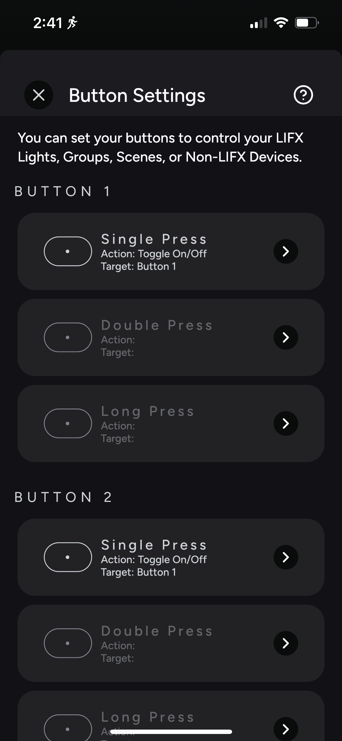
Button list
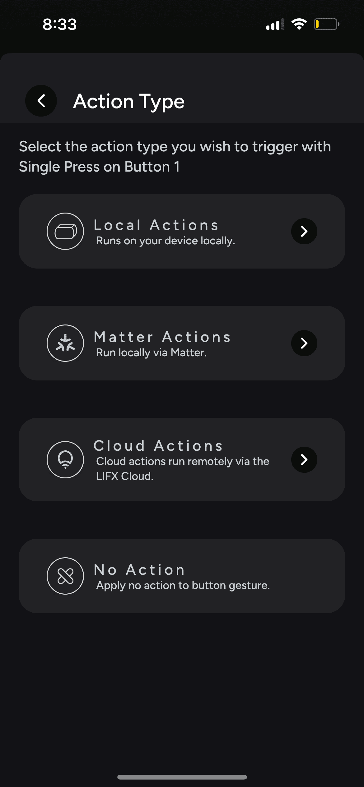
Choose an action type
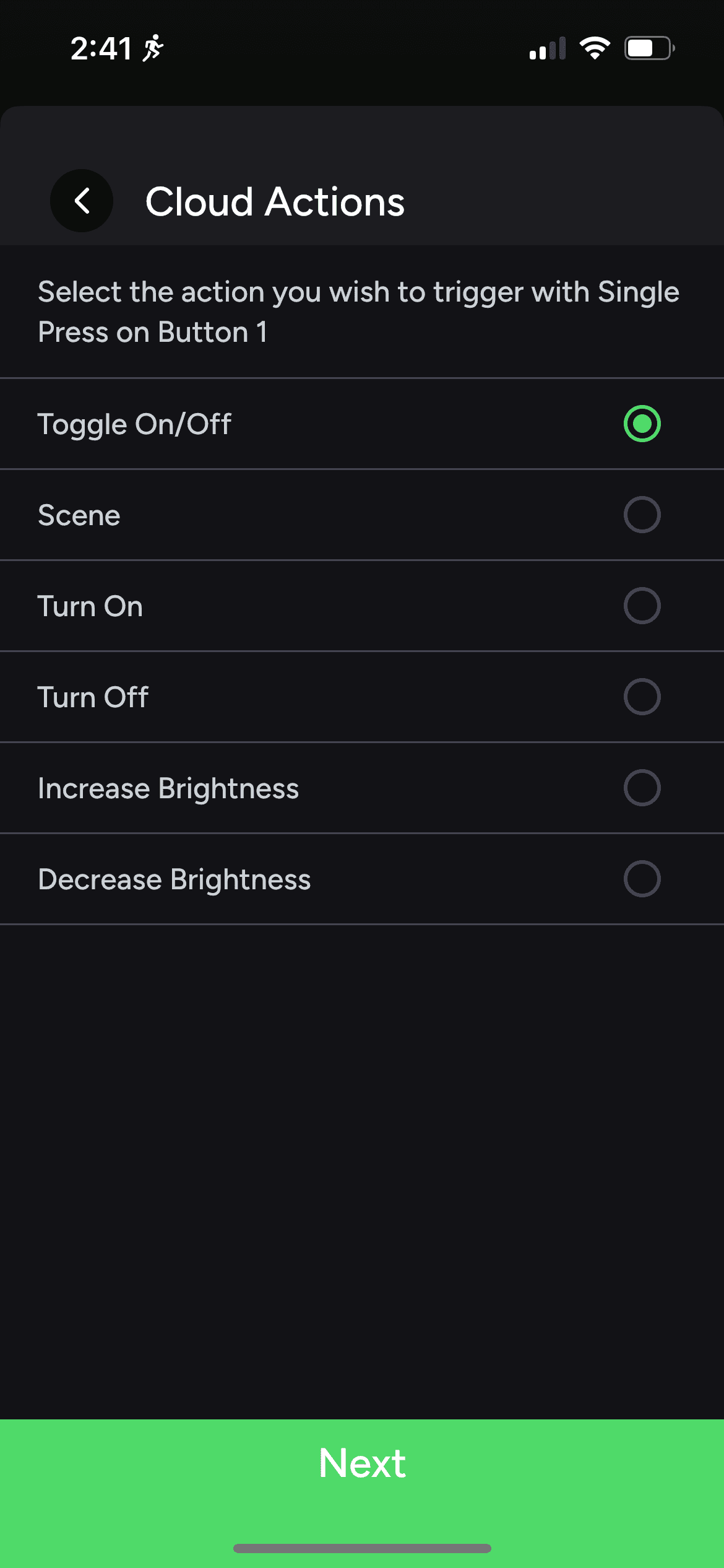
Add an action
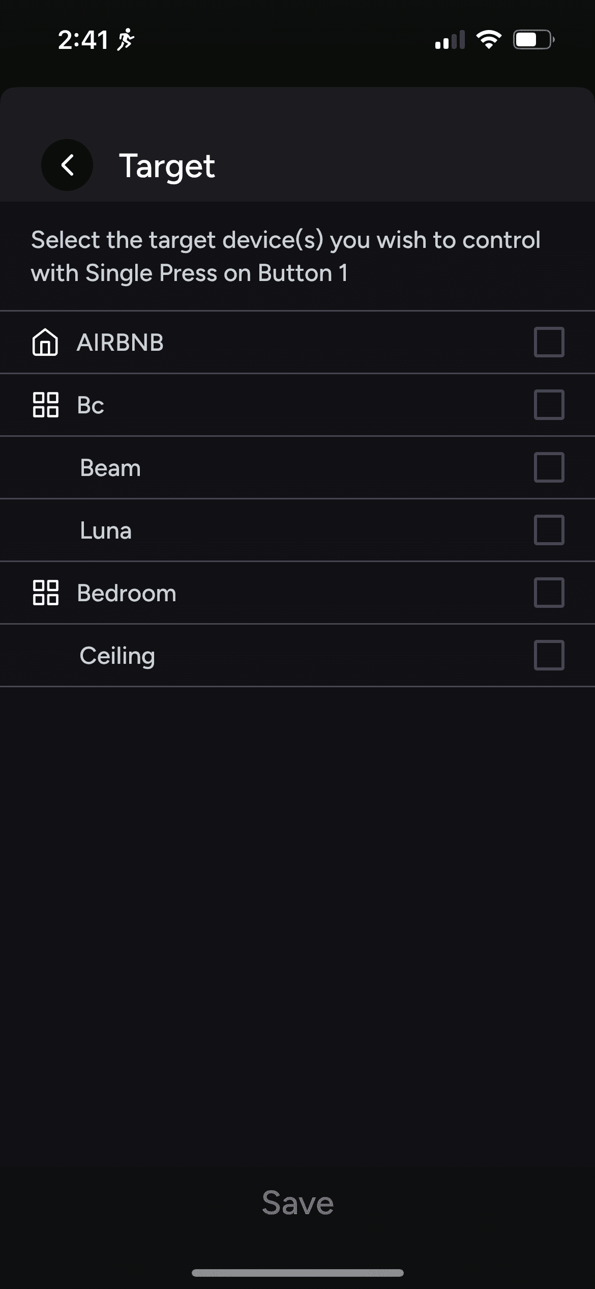
Add target(s)
⚠️
Every button and press variation is shown upfront, creating an overwhelming list.
⚠️
Action types (Matter, Cloud, Device) read as technical jargon to non technical users.
⚠️
One way selection forces action before target, opposite to how users naturally think.
⚠️
No way to edit a configured button afterwards, users had to repeat the entire setup each time.
Approach
Design principles
The legacy flow had to be rethought, but the goal was not a bigger feature. It was a clearer one. Three principles guided every decision in the redesign.
↘
One button, many presses. The interface should keep them grouped, not flatten them into a list.
↘
Let editing happen without starting over. A configured button should be adjustable, not rebuilt from scratch each time.
↘
Hide technical decisions when they are not the user's problem. Action types like Matter, Cloud, and Device are implementation details, not setup choices.
Solution
The final design
#1
A grouped button list
The flat list is gone. Each button is now an expandable card, grouping its press variations underneath. Users tap to reveal them when needed."
Button list
#2
A two-way editor
Users can choose a target or an action first, in either order. Existing configurations can be edited directly, without starting over.

New configuration

Configured
#3
No more action types
The Matter, Cloud, and Device choices have been removed entirely. The system selects the best action automatically based on the target.

'Add an action'
bottom sheet

'Add targets'
bottom sheet